
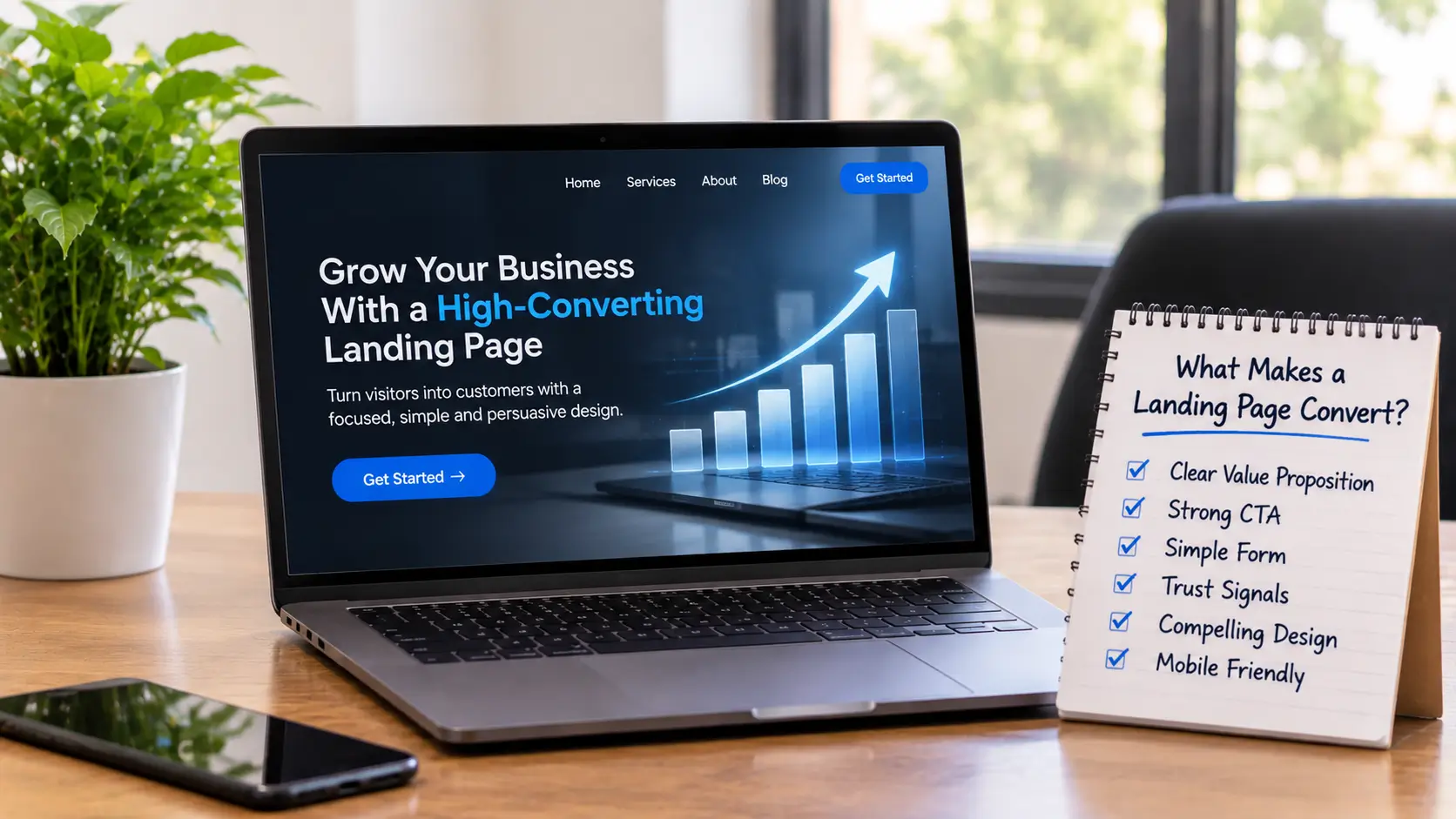
A landing page is a single page built for one purpose, such as getting a quote request, a sign-up or a phone call. Visitors usually arrive from an ad, an email or a search result, so the page has to match what they clicked on. Good landing page design comes down to a handful of choices, listed below.
Give the page one goal
Decide what you want the visitor to do and build everything around that. If the goal is a quote request, every section should lead toward the form. A page that asks visitors to read the blog, follow you on social media and book a call all at once gives them too many places to go.
Write a headline that matches the click
The headline is the first thing people read. It should say what you offer and who it is for. If your ad promises a free website review, the page headline should mention a website review. A mismatch makes visitors think they landed in the wrong place.
Explain the offer in plain language
Right under the headline, add a short paragraph saying what the visitor gets and why it is useful. Write about their problem first and your service second. Keep sentences short. Most people skim a landing page, so they should understand the offer in a few seconds.
Use a clear call to action
Your button should say what happens when someone clicks it, for example “Get a free quote” or “Book a call”. Use the same wording each time it appears and make the button easy to see. Repeating it further down the page helps people who read to the end.
Keep the form short
Every extra field is another reason to give up. Ask only for what you need to follow up, usually a name, an email address and a short message. You can collect more details in the first conversation.
Show why people can trust you
Visitors want to know that other people have used your business and been happy. A short testimonial, a number of years in business or a count of completed projects can help. Only use facts you can back up.
Remove distractions
A landing page does not need your full navigation menu. Extra links give visitors a way to leave before they act. Keep the page focused, and link out only where it truly helps.
Make it work on a phone
Many visitors will arrive on a phone, so check that the headline, text, form and button all work on a small screen. Buttons should be easy to tap and the form easy to fill in with a thumb.
Test and improve
After the page goes live, watch how it performs. If many people visit but few act, look at the headline, the offer and the form first. Change one thing at a time so you know what made the difference.